


Unlock Your Photography Skills with These Simple Rules

"Rules" in photography are more accurately described as "guidelines" or "principles" of composition.
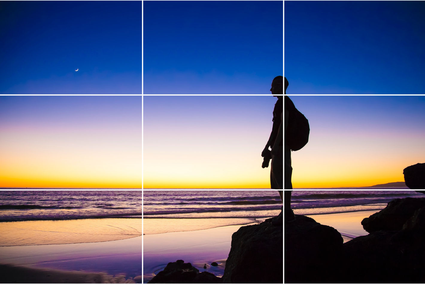
1. The Rule of Thirds:
This is one of the most fundamental and widely used composition guidelines.
- The Principle: Imagine your image is divided into nine equal parts by two horizontal and two vertical lines. Instead of centering your subject, you place it along these lines or at the points where they intersect.
- Why it Works: Centering a subject can sometimes make an image feel static and uninteresting. The Rule of Thirds creates a more balanced, dynamic, and engaging composition by leading the viewer's eye through the scene.
2. Leading Lines:
This technique uses natural or man-made lines to guide the viewer's eye through the photograph.
- The Principle: Leading lines are visual pathways that draw attention to a specific point of interest or create a sense of depth and dimension. They can be straight, curved, diagonal, or even implied.
- Why it Works: They create a sense of direction and flow, making the image more dynamic and helping to tell a story.

3. Symmetry and Patterns:
Symmetry and patterns can create a powerful and visually appealing composition, especially when used intentionally.
The Principle:
- Symmetry: This involves creating an image where elements on one side are a mirror image of the other, often using a central line (horizontal or vertical) to divide the scene.
- Patterns: This involves the repetition of a shape, color, or other element.
- Why it Works: Symmetry creates a sense of balance, harmony, and order. Patterns are visually interesting and can create a rhythm or texture within the frame.

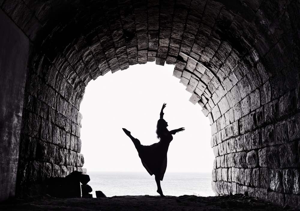
4. Framing:
This technique uses elements within the scene to create a "frame" around your main subject.
- The Principle: By using objects like doorways, windows, trees, or arches, you can create a natural border that draws attention to the subject and adds context and depth to the image.
- Why it Works: It adds a sense of depth and can make the viewer feel as though they are peeking into a scene.
5. Negative Space:
Negative space is the empty area around and between the main subject.
- The Principle: Rather than filling the entire frame with a subject, you use empty or minimalist space to highlight the subject.
- Why it Works: It gives the main subject room to "breathe," prevents the image from feeling cluttered, and can create a sense of simplicity and a powerful visual statement.

6. Balancing Elements:
Balancing elements refers to the distribution of visual weight within a photograph.
- The Principle: A photograph can have either symmetrical balance (as mentioned above) or asymmetrical balance, where a large, dominant subject is balanced by a smaller, less prominent one.
- Why it Works: A balanced image feels stable and harmonious, while an unbalanced one can create a sense of tension or unease, depending on your intent.

➡️Remember, these are not rigid laws, but rather a set of tools to help you create compelling images. Once you understand them, you can experiment and break them purposefully to develop your own unique style.
@vivo India @GauravSingh @Baljeet @Gourav_joshi @SanketUrane @Aman @LoserAnant @BAPI @Kirti🤍
Please sign in
Login and share